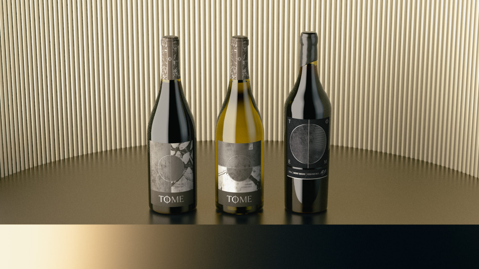
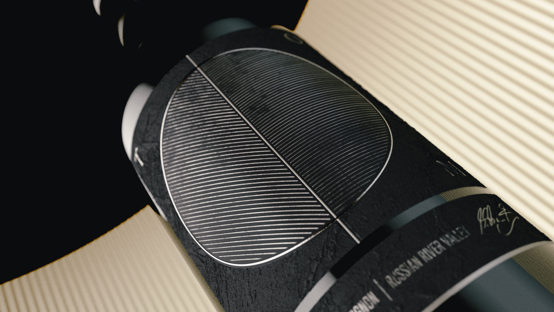
Tome Wines
Reading between the lines. Branding for an unexpected Napa Valley winery.
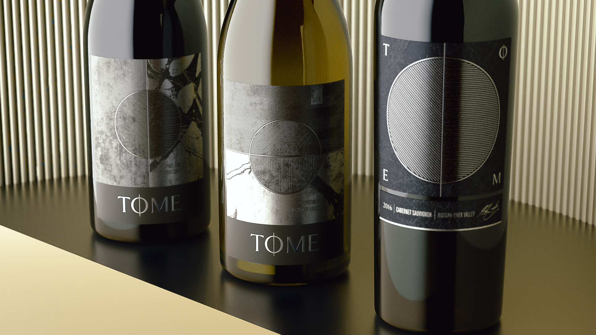
The inspiration for this wine label design comes from the name: tome. Tome is a fancy word for book. The parallel lines one sees when looking at a book on edge inspired the hatching in the design. The layered metallic patinas evoke a feeling of tension and drama, which is reflective both of a good story, and the contents of the bottle.